This documentation is for the HubSpot Two Column Carousel With Content Module created by Hermitcarbs team
CONTENT FIELDS
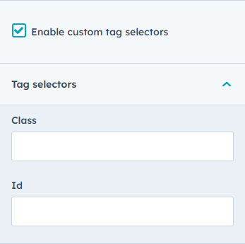
- Enable custom tag selectors boolean to use id and class field.
- Add Section Id and Class selector according to requirements.
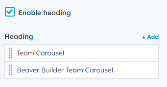
- Enable heading boolean to use heading field.
- Add Title and subtitle using heading type and heading style.
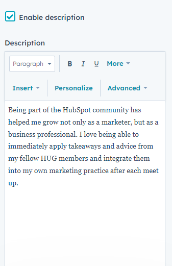
- Enable Description boolean to use Description field.
- Add the Description you want to show using the rich text field.
BUTTON FIELDS
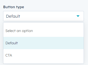
- Add Standard button and CTA button according to requirements.
- Add button text
- STYLE FIELDS
- Text: Choose Text styling of button
- Background: Choose Background color of button
- Border: Choose Border style of button
- Corner: Choose border radius
- Spacing: Choose Spacing around button
CARD FIELDS
- Image: Choose your team member image
- Name: Write your team member name
- Designation: insert designation of member
- Desciption: Write team member short bio
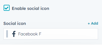
- Enable social icons boolean to use social icons field.
- Add Social icons
- STYLE FIELDS
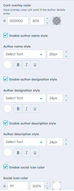
- Choose Card overlay color.
- Enable author name style boolean to use author name style field.
- Choose author name styling.
- Enable author designation style boolean to use author designation style field.
- Choose author designation styling.
- Enable author description style boolean to use author description style field.
- Choose author description styling.
- Enable social icon color boolean to use social icon color field.
- Choose social icon color.
STYLE FIELDS
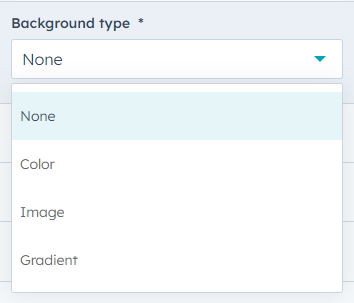
- Add Backgound with multipal option (Color only, Image with overlay, and Gradient)
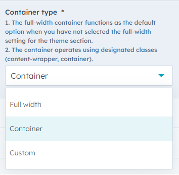
- Choose Container type
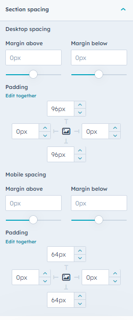
- Add Spacing of the section
- Typography style
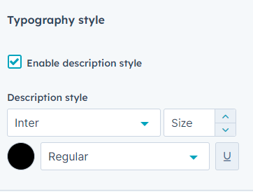
- Enable description style boolean to use description style field.
- Choose Text styling of Description
- Enable description style boolean to use description style field.
